Saturday, October 28, 2023

reflecting

last week I went for a walk around the little lake, the one right in town, in search of interesting reflections

I've always found reflections to be such interesting things... there, but not real, at the mercy of light and movement

fleeting

I had read recently that a good way to abstract something is to heavily edit a photograph of it... altering colour, definition, cropping and so on and I was keen to try it out

I wanted images of reflections because I've been doing a lot of work with water images lately and want to continue exploring it but also because I like the tension of trying to distort something beyond it's reality when it really has no foot in reality at all

below is the first original image, no editing at all and from this, I created the next one


I like how extreme cropping changes the texture of the branches, emphasising all the bumps, buds and knots

a "dramatic warm" filter flattened the background, lightened it, evening out some of the values and adding some interesting highlights


this next one is the original for the two that follow


again, heavily cropped, right through the horizontal middle

the same "dramatic warm" filter


 a heavy crop with just the left half remaining

it was interesting how just cropping it changed the value, darkening the branches and the background dramatically 


the final one


cropped, same filter


cropped agin


and then cropped the crop

love this last one - it's the one where I finally get closer to abstraction

it's not all the way there but the elements are distorted enough that I think the image would be understood to not be of the landscape as it was seen


the more I crop the more interesting things come to light - I suppose it's something to do with the magnification, isolation and/or distortion of various elements and components, the way colours get altered with the underlying tones coming forth

and with reflections, it's also the way things just aren't quite the way should be

I like that photographs that are not at all good can still yield very interesting images, with the simplest little digital editing in just minutes

I think I won't be quite so quick to hit the delete button from now on


Saturday, October 21, 2023

what if i... ?

experimenting with materials is just so darn interesting... 

a little over a year ago I experimented with gelli-plate printing on linen cloth using acrylic paints as well as inks with mixed results

a few pieces turned out rather well but most were a little less successful

last week I had a hankering to try again but before I could get the plate out a different idea wandered along

what if I did a kind of gathered resist dyeing with linen but instead of dye I would use the paint from last week's paper painting trials, a Schmincke Horadam super-granulating watercolour paint?

I cut several pieces of vintage linen in a variety of weights and set to work gathering a couple of them using a strong buttonhole thread

no research - no looking up ways to gather to make water-like effects, just going with what I thought I knew


once gathered I wetted the fabrics a bit by sprinkling water on them and letting it soak in for a few minutes and then I dabbed on the paint, letting it soak in, adding more, turning it over and over again until it seemed fairly well saturated


the next morning they were still rather wet so I spent the day turning them over regularly, noticing how the paint shifted, one side darker than the other as the paint moved back and forth with each turn

as it dried the movement became less and less noticeable and after about 24 hours they were dry enough to remove the gathers and press

the brown in the colour settled settled on the folds and in some places adding a wonderful effect, reminding me of the golden light that hits the water ripples under a darkened sky


the other side, a paler version with more of the brown


another one made the next day


in addition to water I also had wood on my mind


below is a cropped portion of the photo above, the colour digitally altered 

I love this image and have worked with it a lot and having a fabric version would be a wonderful thing so I pleated a piece of linen and stitched that tightly along the length of it


I don't have a photo of that first attempt - the "boards" were too far apart and the colour rather faint and uninspiring so I re-folded it, making narrower folds in the hopes of getting smaller boards and this time stitched the length twice

and this time I got exactly what I wanted


just like old, rough, weathered wood - maybe a bit more blue but I like that


I have more to gather, and to pleat and am also going to try it with some fine silk chiffon

I love working like this... thinking, trying, adjusting and trying again

not ready yet to think further down the road to how I'll use them though that won't be too far off

for now I'm happy where I am


Saturday, October 14, 2023

I Think I Know Now


I've been trying to puzzle something out for a while and I think I now know what the answer is... 

but I'm getting ahead of myself as I've not yet stated what the puzzling was all about

there's a lot of chatter online from people wanting to find their artistic voice and those who think they can provide assistance

I've never put much stock in any of that as I already know what I like and what I don't and I am fairly confident that there is a distinctive quality to my work that makes it mine and for people that are all familiar with me, easily recognizable

what I have struggled with is finding a process for my work, especially when it comes to anything conceptual

where to begin?
what to do next?
then what?

figuring that out has never come easy - there are tried and true ways of working through initial inspiration and ideas but I can get bogged down with them and they become the work

Sometimes I want sketchbooks to work in, not sketchbooks that are the work

and then there's all the thinking... I like thinking and I do a lot of it, every day, but again...  the ideas tumble in and through and around and sometimes that's fine but it's not always what I want

 sometimes I want to just do something!

 with my latest desire to explore the people and landscape of the Klondike GoldRush, I decided fairly quickly on that I didn't want to get bogged down with any of that

I just wanted to look at an image or two and do something spurred on by it

first with the mountain-inspired paper and cloth collages, then the clothing inspired small textile pieces and today it was images of water and trees


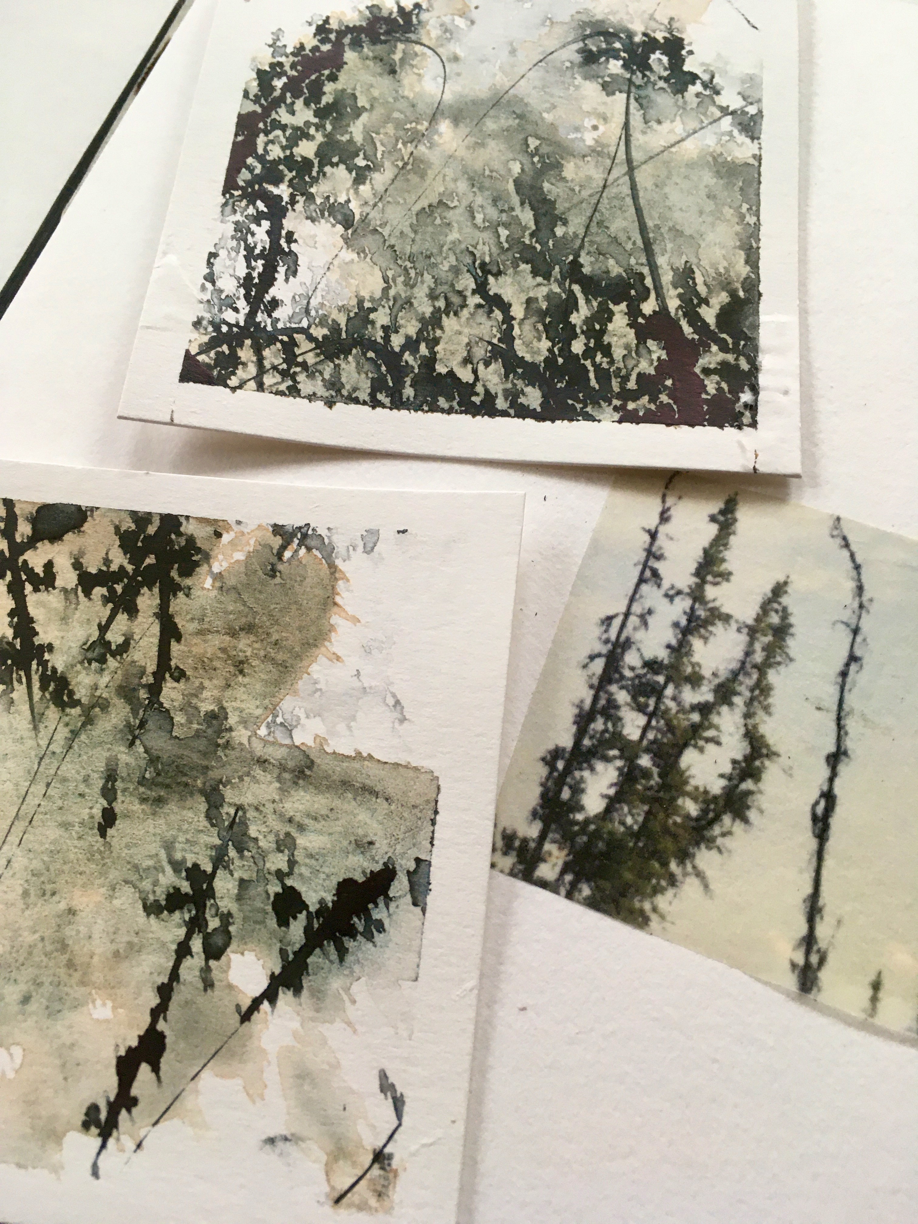
the image on the right is a heavily edited crop from a photo of the Yukon River taken in 2018, printed on clear acetate and on the left is a tracing paper print of trees at Marsh Lake taken in 2022

overlaid like this, the branches of one connecting with the other

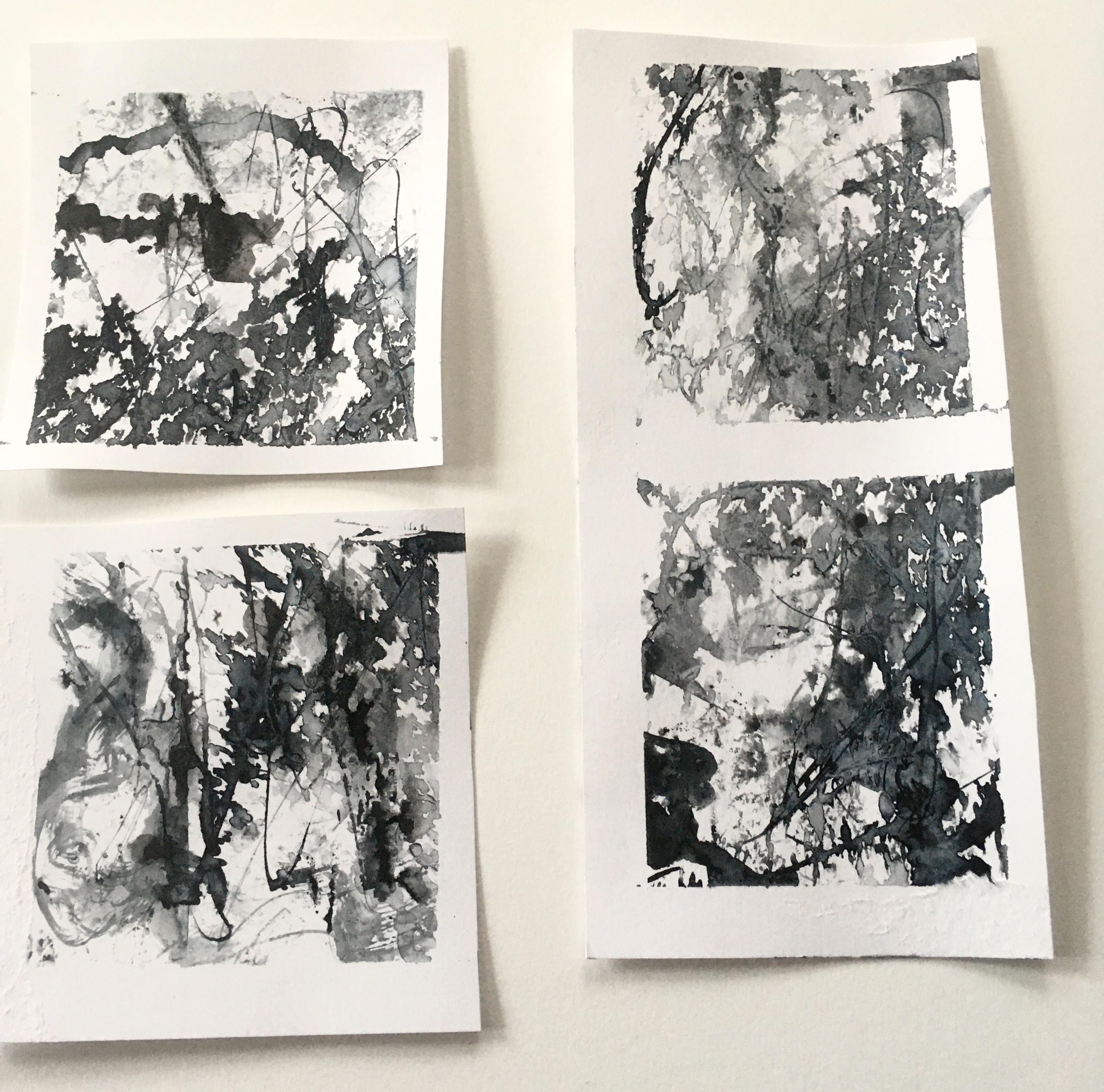
I decided to do some small ink studies in the same kind of blackened blue as the trees, looking to get some similar lines and shapes as well

with a dip pen I scrawled lines from one of Robert Service's poems across Bristol board and then sprayed water onto the wet ink

the water droplets hit the ink and dots of colour exploded from the lines - they reminded me of the skinny trees in the photo above

a few squirts more, in an effort to create even more skinny tree-like shapes and I had ruined the whole effect with what were now large splotches of faded colour

hmmm...


round two would be on a better quality mixed media paper but I had the idea to paint some watercolour on first, to reference the water

once that was dry, more expressive words by Mr. Service with the same Payne's Grey ink and this time a gentler touch with the spray bottle


much better!


laid next to the images, the correlation is distinct and yet somewhat abstracted

exactly what I was hoping for


doing, not planning

rather than swatching the colours, making something with them

start with what I know and see what comes next

at any point along the way I can stop and do formal explorations and investigations but for now, just trying things out feels like a better way... almost like falling right in to the work rather than testing the waters first

these wise words I discovered today say it best:

"I am still thinking, and my thoughts are guiding my choices... But I am out of my head and thinking with my hands."

Helen Terry 
2014


Saturday, October 7, 2023

some days, some weeks

some days can feel rather unproductive... this has been a full-on week of them

no particular reason why, just a whole series of small things that get in the way of doing any big things and at the end of it I feel as though I'm still in the place where I began

I haven't had much time for my work with the Gold Rush era of Yukon history but I have often thought of the clothes of the day... 

warmth and practicality to clothe the miners and travellers 

beautiful garments for the dance hall girls

silk, wool, velvet, lace, cotton duck, mackinaw
dresses from Paris, sturdy homespun

though how to use them?

wool appeared in the collages from the last few posts and I'm sure cloth and lace will factor in future ones but for now I just want to work with the cloth without it having to do or be anything other than itself

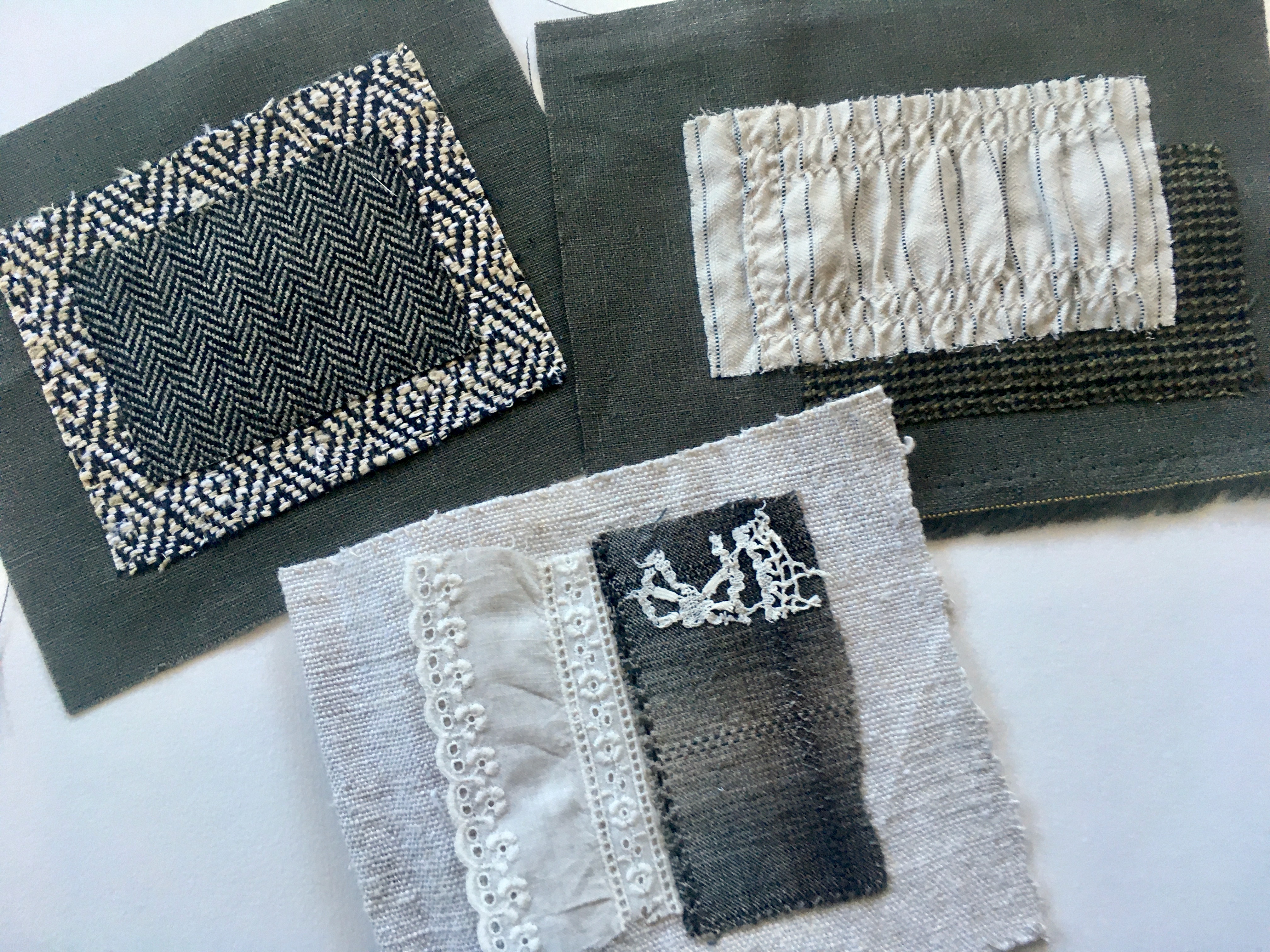
I cut random sized pieces from a variety of cloth in my stash, choosing textures, colours and patterns that appealed

looking through the stacks I discovered combinations that appealed and so I cut smaller pieces from them and began to layer and arrange them

this first one is a nod to the landscape but through the patterns of the cloth, not a pattern made by them

the uppermost layer is a dark green and black herringbone wool

trees - obvious, yes, but still...

the layer beneath that is off-white and black diamonds... mountain peaks?

also obvious but even so

I like the graphic nature of this and so regardless of any of how obvious it might or might not be,  I went with it

I have an idea for what comes next but there's been no time to act on it, nor will there be for a few days yet


the next one started with a scrap of heavy cotton, gathered by machine

cut from a sun dress I bought many years ago - the first of a few things I bought for the fabric and/or detail in the construction, not as something I would ever wear

 it was simply "fabric in a different form", not an article of clothing

and beneath thata scrap of wool and beneath that a dark greenish-grey linen, the same as in the piece above


these led me to remember some pieces I had begun several years ago using favourite scraps of cloth and lace

these have a "remains of the day" kind of feel to them


the linen for the base is 110+ years old, hand spun and hand woven in the Netherlands just after the turn of the twentieth century

vintage lace and homespun fabrics


as I said, there's a plan for the first two pieces shown here but as ever I'm not sure where rest are going and it may be they are kept just like this, folded and then bound into a book of sorts, snippets of imagined days and lives gone by

and if that's all they are it will be enough

Saturday, September 30, 2023

connections

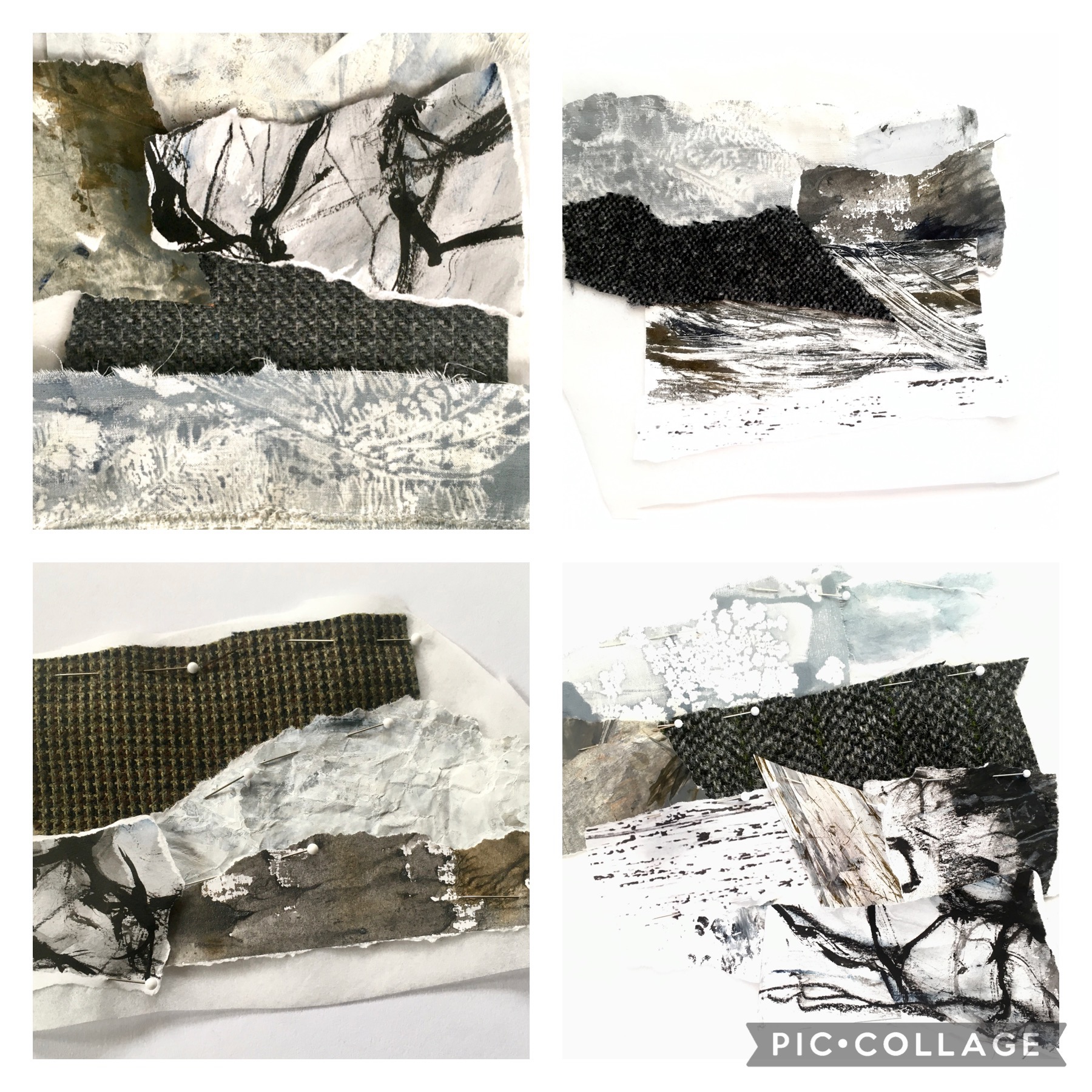
in the end I made four collages... the first took the longest, the fourth came the quickest (though it is also the smallest)

the second and the third are the most interesting compositionally

in the image below they appear in this order

3    2
4    1


I think because of it's simplicity #4 was my initial favourite and I had a hankering to add stitching to it
for reasons I didn't understand I decided it needed a dark fence added to the landscape

fences were not common in the Yukon though with the number of people moving there from the rest of Canada fences are now becoming more and more common, especially in town

anyway, I wanted a fence and though it made no sense whatsoever I decided that was the point of sampling - so you could scratch the itches and see where they take you

nothing ventured, nothing gained


I had barely finished it and my thoughts wandered here...


an image of the Chilkoot Trail from 1898
(this section is often referred to as "The Golden Staircase")


The Royal Canadian Mounted Police required that each person crossing in to the Yukon had to have a specific amount of food and gear in order to survive for one year and it would have weighed in at approx. 2000 pounds

estimates are it required a minimum of fourty trips over the Chilkoot Trail to haul in that amount of gear 

day after day, week after week, month after month they climbed and carried


as I looked at the little fence I stitched, delighted with the results, I realized that if it was angled up the mountain side it would be like the climbers on the chilkoot

so that's what I did


that never-ending line


I stitched them in the same manner as the fence, first the uprights, then a linking stitch, under two posts, loop around and back under the second one and the next one and repeat and as I went I realized these tough, tough men and women (yes, they climbed it too) were also a fence

linked together they could support each other if needed - independence was valued (and required) but people also recognised that sometimes people needed a helping hand 

fences stand strong when each of the posts are strong, but when one can't be, the others will hold it upright until it is 

it's these connections that I love about the work I do - they make me think and lead my work into interesting places

Saturday, September 23, 2023

Abstracting the Landscape

a friend in the Yukon sent me a photo this week taken on Montana Mountain

the Yukon is chock-a-block full of deserted mines and many are found high in the mountains... this photo is of one of them

there are interesting elements in this image so I thought I'd play around with it a bit
(my friend has granted me blanket permission to do what I will with her photos which I will forever be grateful for)

 as part of Karen Ruane's online course "Alchemy" I want to work with the Yukon as my subject but I still haven't quite settled on exactly what and how... a lot of ideas are floating around but nothing is really grabbing me, and so I shall play with a few ideas to sink into the subject, try some different processes and see where they take me


I began by toning down the colours - the Yukon sky is a bright blue almost all of the time but I wanted more of a winter tone, a slightly faded, greyer version

I think it lets the whites be brighter and the textures of the landscape come forward


I gathered a few fabrics for the mountains and then a collection of fabric and papers I had painted or  printed

the first one you see here is the first one I did

it's so obviously laboured over - the next three went quicker, the last especially so

but this one... too busy, too many pieces

when all was said and done I went back and did a few edits on this and one other one - they're all pinned now and ready to be basted


this one was the third and it also looks different now, a couple of minor changes but surprising how much they have changed things


and this is the last one - it was also the quickest, perhaps because it's also the smallest, but I also think this kind of work gets easier the more you do it


I am not trying to replicate the photo, not wanting to duplicate the scene, just taking elements I see in it and incorporating them in these small collages
nothing needs to be in the right place, nor at the correct scale

so now to baste them and then see what comes next

no idea what that might be but I'm sure looking forward to figuring it out

Saturday, September 16, 2023

looking and seeing

my love of blue and gold continues

now that much of the immediate smoke has drifted away and we are left with a thick smudge of it on the horizon, the sunsets are duskier than usual, the blue shadows deeper and the pinks of sunset softened with the yellow tones of smoke in the air

a few nights ago i happened by the window at just right the moment and noticed this


if you click on it for an enlarged version you'll see the layering of the hills and mountains in the distance, quite notan-like i think

I do like the lack of definition the smoke provides 

i'm still playing with photo editing and layering images and decided to make a concerted effort to improve my photographs 

the local library had a few books on the subject and this one  Art With an iPhone had some beautiful images, mostly done within a variety of apps but there are also good suggestions for getting better initial shots and though i haven't had time to really dig in to it i tried working with one image a few days ago, just to get my feet wet

the photograph below was taken on a very cold winter morning in the yukon this past spring

27 below zero, the sun just coming up to the horizon


i switched to "silverlight" in iphoto

it's interesting to look at the differences between black & white, monochrome and silverlight - they're very subtle yet definite


i imported that into the app "distressed fx" to add a textured layer

a kind of "grunge" background that seems to bring back the original blue and yellow in a most interesting way and there are lines in the background that add so much interest yet they don't compete with the tree branches at all


i'm not so much interested in doing this as the endgame - i'm more interested in using it as an idea generator... a way to change things without being committed, to experiment and see how certain colours or textures might look and then to take that information and do my own thing

recently our son was in croatia for a vacation with his girlfriend and he sent me this image


it feels like i'm looking at the scene an old master would have drawn inspiration from for a painting - that sky! and the water... the slashes of pale blue in the left foreground... the row of weathered buildings with the hit of red in the centre

so much to learn from it i feel as though i could study for months and still see something new each time i look at it

the combination of blue and gold holds that kind of fascination for me - i've seen so many iterations of the two colours together, each one strikingly different

the more you look, the more you see