Saturday, September 30, 2023

connections

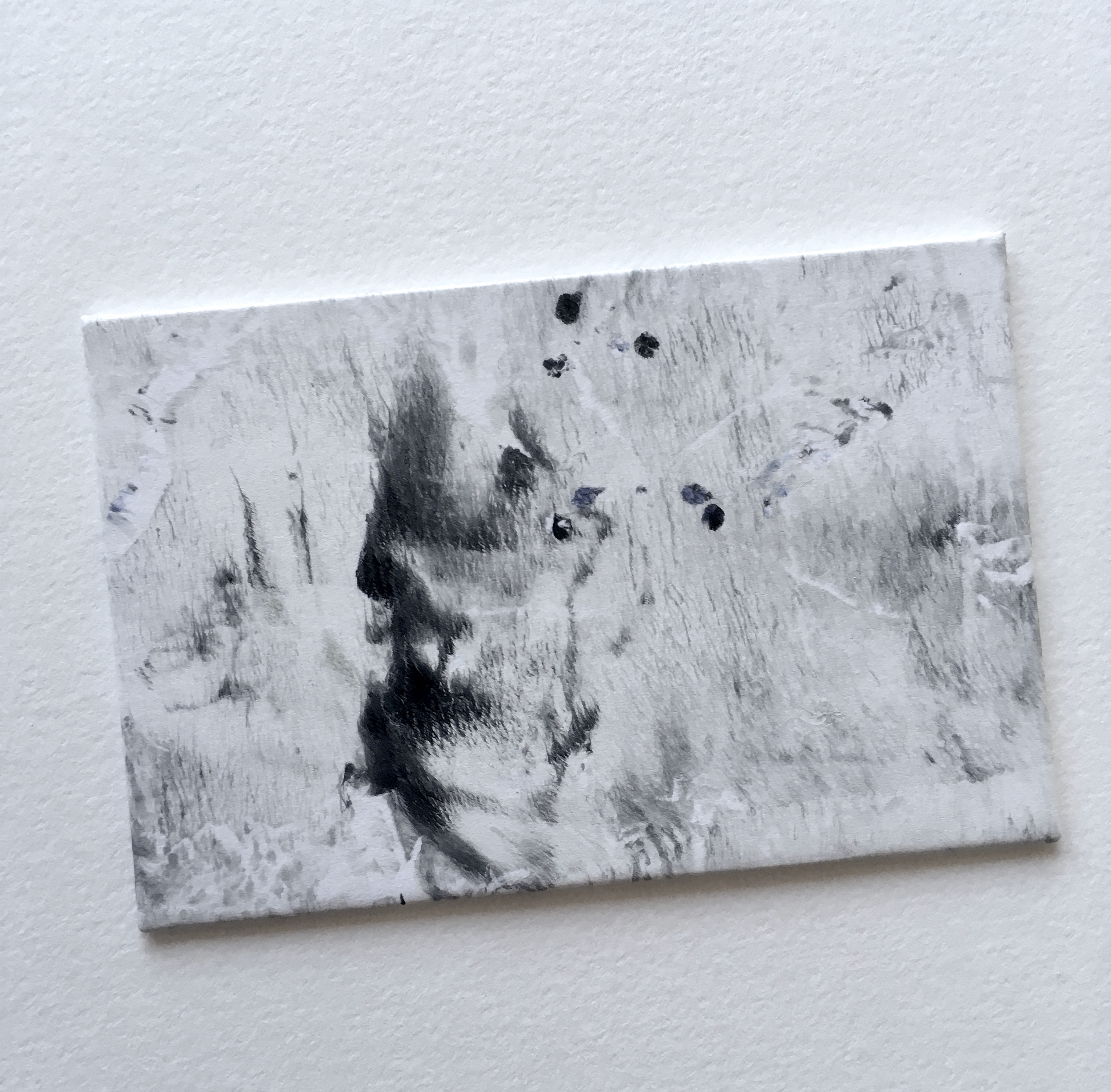
in the end I made four collages... the first took the longest, the fourth came the quickest (though it is also the smallest)

the second and the third are the most interesting compositionally

in the image below they appear in this order

3    2
4    1


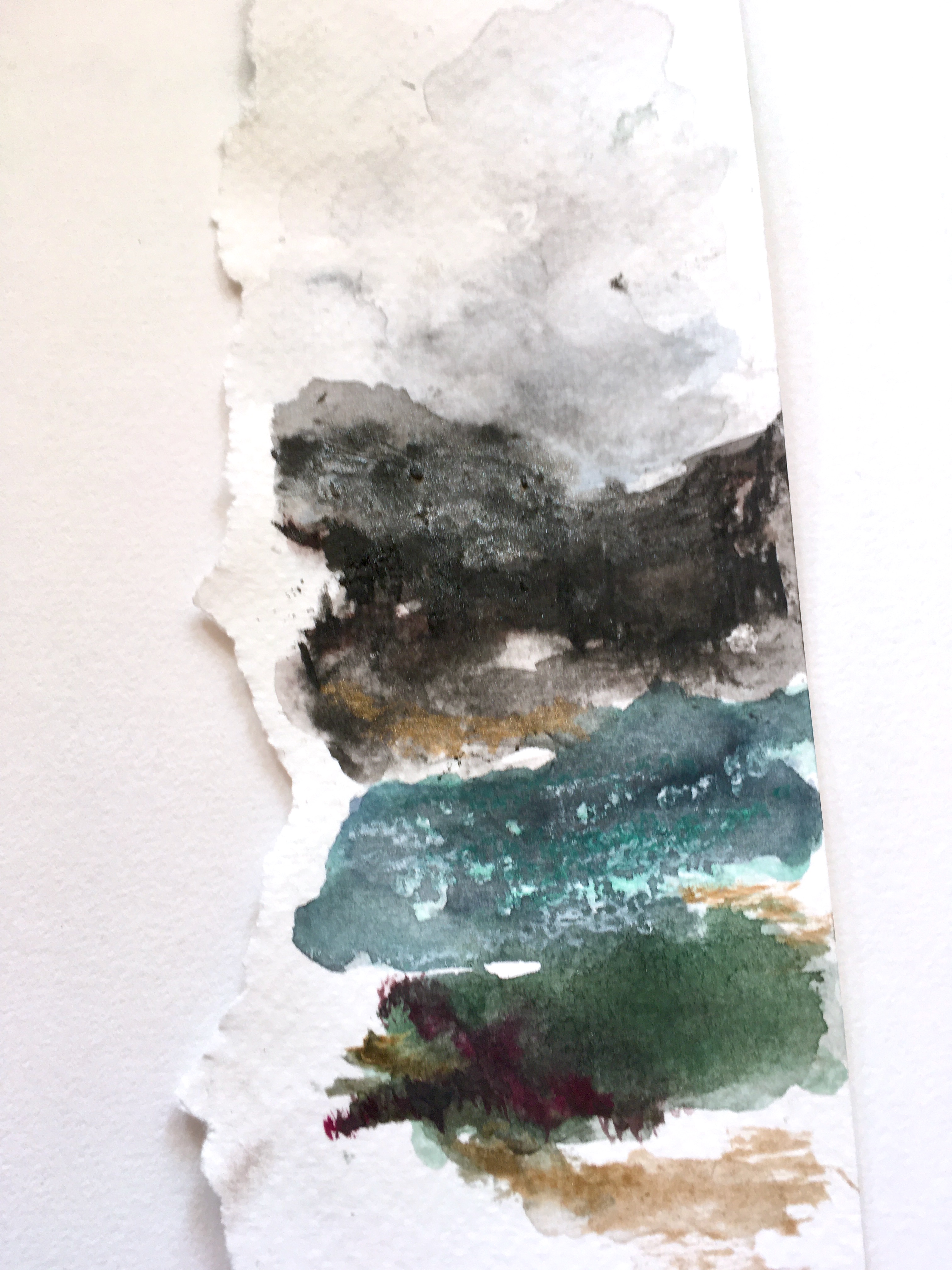
I think because of it's simplicity #4 was my initial favourite and I had a hankering to add stitching to it
for reasons I didn't understand I decided it needed a dark fence added to the landscape

fences were not common in the Yukon though with the number of people moving there from the rest of Canada fences are now becoming more and more common, especially in town

anyway, I wanted a fence and though it made no sense whatsoever I decided that was the point of sampling - so you could scratch the itches and see where they take you

nothing ventured, nothing gained


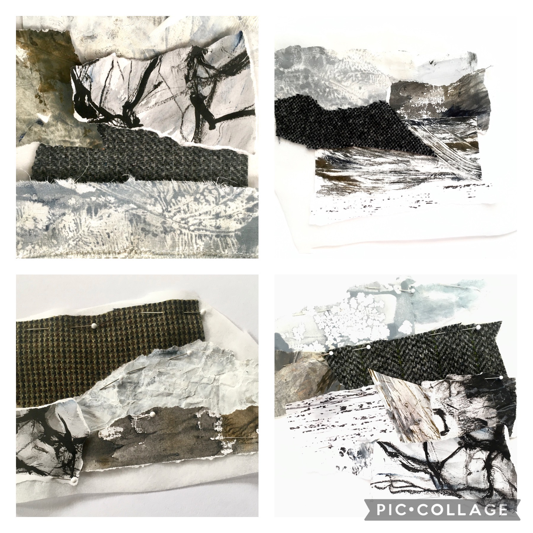
I had barely finished it and my thoughts wandered here...


an image of the Chilkoot Trail from 1898
(this section is often referred to as "The Golden Staircase")


The Royal Canadian Mounted Police required that each person crossing in to the Yukon had to have a specific amount of food and gear in order to survive for one year and it would have weighed in at approx. 2000 pounds

estimates are it required a minimum of fourty trips over the Chilkoot Trail to haul in that amount of gear 

day after day, week after week, month after month they climbed and carried


as I looked at the little fence I stitched, delighted with the results, I realized that if it was angled up the mountain side it would be like the climbers on the chilkoot

so that's what I did


that never-ending line


I stitched them in the same manner as the fence, first the uprights, then a linking stitch, under two posts, loop around and back under the second one and the next one and repeat and as I went I realized these tough, tough men and women (yes, they climbed it too) were also a fence

linked together they could support each other if needed - independence was valued (and required) but people also recognised that sometimes people needed a helping hand 

fences stand strong when each of the posts are strong, but when one can't be, the others will hold it upright until it is 

it's these connections that I love about the work I do - they make me think and lead my work into interesting places

Saturday, September 23, 2023

Abstracting the Landscape

a friend in the Yukon sent me a photo this week taken on Montana Mountain

the Yukon is chock-a-block full of deserted mines and many are found high in the mountains... this photo is of one of them

there are interesting elements in this image so I thought I'd play around with it a bit
(my friend has granted me blanket permission to do what I will with her photos which I will forever be grateful for)

 as part of Karen Ruane's online course "Alchemy" I want to work with the Yukon as my subject but I still haven't quite settled on exactly what and how... a lot of ideas are floating around but nothing is really grabbing me, and so I shall play with a few ideas to sink into the subject, try some different processes and see where they take me


I began by toning down the colours - the Yukon sky is a bright blue almost all of the time but I wanted more of a winter tone, a slightly faded, greyer version

I think it lets the whites be brighter and the textures of the landscape come forward


I gathered a few fabrics for the mountains and then a collection of fabric and papers I had painted or  printed

the first one you see here is the first one I did

it's so obviously laboured over - the next three went quicker, the last especially so

but this one... too busy, too many pieces

when all was said and done I went back and did a few edits on this and one other one - they're all pinned now and ready to be basted


this one was the third and it also looks different now, a couple of minor changes but surprising how much they have changed things


and this is the last one - it was also the quickest, perhaps because it's also the smallest, but I also think this kind of work gets easier the more you do it


I am not trying to replicate the photo, not wanting to duplicate the scene, just taking elements I see in it and incorporating them in these small collages
nothing needs to be in the right place, nor at the correct scale

so now to baste them and then see what comes next

no idea what that might be but I'm sure looking forward to figuring it out

Saturday, September 16, 2023

looking and seeing

my love of blue and gold continues

now that much of the immediate smoke has drifted away and we are left with a thick smudge of it on the horizon, the sunsets are duskier than usual, the blue shadows deeper and the pinks of sunset softened with the yellow tones of smoke in the air

a few nights ago i happened by the window at just right the moment and noticed this


if you click on it for an enlarged version you'll see the layering of the hills and mountains in the distance, quite notan-like i think

I do like the lack of definition the smoke provides 

i'm still playing with photo editing and layering images and decided to make a concerted effort to improve my photographs 

the local library had a few books on the subject and this one  Art With an iPhone had some beautiful images, mostly done within a variety of apps but there are also good suggestions for getting better initial shots and though i haven't had time to really dig in to it i tried working with one image a few days ago, just to get my feet wet

the photograph below was taken on a very cold winter morning in the yukon this past spring

27 below zero, the sun just coming up to the horizon


i switched to "silverlight" in iphoto

it's interesting to look at the differences between black & white, monochrome and silverlight - they're very subtle yet definite


i imported that into the app "distressed fx" to add a textured layer

a kind of "grunge" background that seems to bring back the original blue and yellow in a most interesting way and there are lines in the background that add so much interest yet they don't compete with the tree branches at all


i'm not so much interested in doing this as the endgame - i'm more interested in using it as an idea generator... a way to change things without being committed, to experiment and see how certain colours or textures might look and then to take that information and do my own thing

recently our son was in croatia for a vacation with his girlfriend and he sent me this image


it feels like i'm looking at the scene an old master would have drawn inspiration from for a painting - that sky! and the water... the slashes of pale blue in the left foreground... the row of weathered buildings with the hit of red in the centre

so much to learn from it i feel as though i could study for months and still see something new each time i look at it

the combination of blue and gold holds that kind of fascination for me - i've seen so many iterations of the two colours together, each one strikingly different

the more you look, the more you see

Saturday, September 9, 2023

still...


still working on books

still loving every minute of it


little ones this time - this one is the biggest of three being worked on at the moment and it's just 3" x 5"

my thinking is they are easier to handle during the binding process, they use up scraps of paper left over from making larger books, and they are somehow even more delightful because of their diminutive nature and i learn something new with each one i make

for this one i used some paper i painted a while ago as i was trying different ways of getting a water-like effect

golden brand fibre paste was brushed on thickly in the hopes it would resembled waves when painted over with watercolours... it was done a little too thickly so the results were not that great but good enough for this kind of learning through making

below is the front cover and there are portions of it that aren't too bad - the trick is less fibre paste and an elegant swooping motion

the paint takes to it differently which enhances the effect of whitecaps on water


the back cover was made from the same sheet of "water" paper but an area that was even less effective

 i used it here because i liked the gold... sunlight on water maybe, or perhaps a nod to the gold that lay beneath


the next one on the list is a very tiny one, measuring in at just 1 1/2" x 3"

another cast-off in my painted paper pile was one that was meant to resemble birch bark but came up a bit short
as i was looking at where to best cut the covers i noticed what looked like a squirrel or gopher hanging on to a tree 


and not far from that was an dark splotch that made me think of a small burrow in the wild grass


looking forward to getting this one done but it's so small i can't do a coptic binding, instead i'm going to use a binding technique from rachel hazel's book "bound" called "kettle stitch binding" where all you do is a kettle stitch at each end of the signatures

it's still done in the same manner as coptic binding so i'll definitely get more practice in dealing with the slip-slide of the signatures that occurs as they get added


not sure how many i'll have to make to be a proficient but i don't care

they make a charming pile


Saturday, September 2, 2023

stacks


i'm slowly working my through an online course demonstrating various ways of interpreting landscape whilst exploring a variety of materials 

as ever, there have been exercises that on first glance held little or no appeal but i've done them all anyway, knowing enough about myself to recognise when i am getting in my own way

these little landscape "stacks" did not fall into that category at all 

so much fun to do

the first ones i made (not shown here) were done using the colours suggested in the course

i struggled with them, both the colours and the landscapes themselves, and in the end was completely dissatisfied with the results... over the course of the day i began to wonder if perhaps the problem was that i had no understanding of a landscape that looked like that 

the next day i changed the palette to one of the north and began again

i know that land, how it looks, what the sky is like, the water - where the colours are and where they aren't


much, much better


these aren't meant to look exactly like a properly laid out landscape; it's more a "stacking" of the elements, though the sky is always be placed at the top - it's a layering of colours and playing with marks

responding to something you see in your work as you go and enhancing it further if you want 


water, rocks, hills, trees, grasses, flowers - whatever, wherever

and in the end they're to be torn horizontally and re-combined, looking for new connections, different landscapes, sometimes adding more painting or drawing

again following what you see and any impulses that arise from that

i'm not ready to tear these ones though - i think i need to make a few more first

but for now, it's "stacks" like the one below that need my attention first!