when I learned to quilt many years ago I spent a lot of time studying the quilts I saw in books and magazines that I liked, the ones I was really drawn to
I looked at the colours, the values, how the shapes and pattern were defined... what types of prints were used - what was the coverage of the design motifs on the fabric?
all of these things and more, when looked at for dozens and dozens of quilts over multiple years, told me quite clearly what it was that drew me to the quilts I loved and in turn that showed me the way to making such quilts for myself
I was consistently drawn to a lot of variety, in both colour and value in each quilt
sparse prints held far greater appeal than dense prints
fragmented patterns rather than boldly defined ones
a very sparing use of bold geometrics
the use of subtle secondary patterns
what could be achieved through combining tones with brights
I realized I didn't have to like every fabric in the quilt, in fact there some I didn't like at all but taken with the whole, they were perfect and the quilt would have suffered without them
and so on
last week I decided to do the same with the the photographs I am most drawn to as well as the samples I've made that resonate the most
I have an inspiration board in my studio space and a while back I had printed some of those photos and put them up along with some of my favourite samples - over time I began combining them, photos with samples or samples with other samples, noticing how some might look good together
the other day I was looking at them again and thought perhaps doing the same kind of analysis with them as I did with quilts might be an interesting exercise and give me some directions to work in
I took photos of the groupings, printed them and have put them in my sketchbook
today I started making a few notes, first of what I'm most drawn to
in this photo, it's the water that strikes me first - the silver gleam, the broken pattern, how it looks like burnished metal in places
the scrubby darkness of the tree-line
the texture of the cliffs
in the painting scrap, it's the abstract nature of the brush strokes, especially at the bottom
in both, I like the high contrast of dark vs light
in the next photo, again the water holds great appeal as do the trees
I like how you don't notice the cabin at first (at least I don't)
the faint broken shadows of the trees on the water
the sky, mottled grey with a yellowish cast in the centre
I find the subtle colours calming and there's a kind indistinctness to the photo I like very much
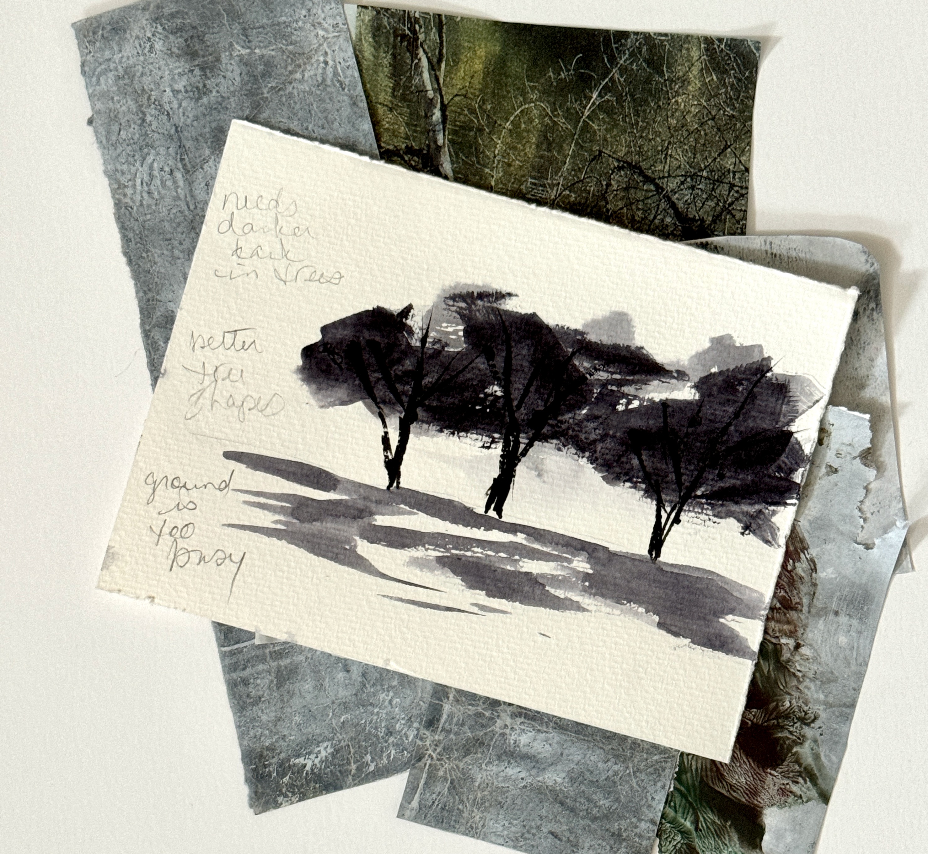
in the painted piece, its the lines with dark blue smudge of colour and the grey at the bottom
(the fabric behind isn't meant to be there)
for these two its the colour (no surprise there!) but I also like the fragmentation and the lack of strong regularity
not all of the marks are good but that means they make the good ones look better - perfection can be the death of expressiveness
I love the dark ink on the rough linen, the smudgy, gritty look of it
the black ink on white paper - loose, expressive, done with the cardboard tube from a roll of aluminium foil... random mark-making that was great fun and when torn into pieces the marks became even more random
the painted piece on the right is a favourite - when I look at it I can the swiftness of my hand as I made those marks with grey paint
swish swoosh
the way the white sparkles through in places because of the rough texture of the paper
that pale blue at the top with a torn white edge
so, now I've done that, what comes next?
I think looking at the commonalities over the four groups and then making notes for other samples to work at; ideas drawn from each pairing utilizing the colours, marks, media and methods that resonated the most
and then putting the three together and looking at it all, again with that analytical eye
and then do it again